Insights Portal
Use Charts and Graphs in the Engagement Dashboard
Current Grade Bar Chart

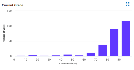
Selecting information in any of the Charts, such as line in a bar graph or data in a graph, will filter the data based on what is selected and returns data for the students and courses where the student has a grade in the selected range. The Current Grade chart dynamically changes to reflect the applied filter. The Summary information also changes to reflect the filtered data.
Time in Content vs. Grade Scatterplot

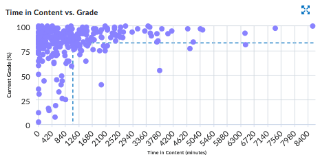
The chart plots students’ grades against the amount of time they spend in the content.
If you select a quadrant, the dashboard filters on the learners and their courses
in that quadrant.
- Data points in the top left quadrant plot learners that have an above average grade and spend below average time in the content.
- Data points in the top right quadrant plot learners that have an above average grade and spend above average time in the content.
- Data points in the lower left quadrant plot learners that have a below average grade and spend below average time in the content.
- Data points in the lower right quadrant plot learners that have a below average grade and spend above average time in the content.
To view the details for the quadrant, hover over the quadrant. Hovering over a quadrant will give information about the number of students in that quadrant.
When filters are applied to the report, the scatterplot also changes to reflect the new query results.
The Time in Content vs Grade scatterplot dynamically changes to reflect the applied filter. The Summary information also changes to reflect the filtered data, as in the same example above.
Course Access Chart

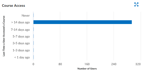
The Course Access bar chart indicates the number of days since students last accessed the course.
Hovering over one of the Course Access bars gives detailed information about the bar. Selecting one or more bars, returns data for the students and courses where the student has accessed a course in that time range.
Note:
If students are enrolled in multiple courses, students can potentially be counted more in more than one date range.
Instructors can use more than one filter on the Engagement Dashboard to display more information.
Content View Chart

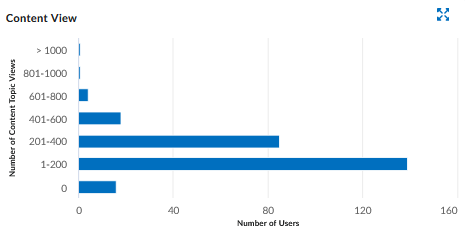
The Content View bar chart aggregates the number of times students looked at course content.
It allows Instructors to review how many times items in the course content tool, such as images, PDFs, or Word files, have been viewed to better understand content viewed offline or that was downloaded.
If Instructors select one or more bars, the dashboard filters the returned data for the students and courses where the learner visited a course the specified number of times.
Results Section Table

The default view of the user list table contains all the users reflected in the dashboard
query results. When you change the courses displayed on the dashboard or apply filters,
the users that appear in the table also change to display those reflected in the new
query results.
For each user, the following information is included in the table:
- First and last name, username and Userid
- Number of the user’s courses reflected in the query results
- Average grade across the user’s courses reflected in the query results
- Average time in the content for the courses reflected in the query results
- Average discussion activity for threads created, threads read, and replies for the courses reflected in the query results
- The last time the learner accessed the system
- Total Users number is reflected in the Summary information